グラフを作成する
1. plotlyをインストールする。
以下コードを実行。
$pip install plotly
2. データを用意する。
今回はサンプルとして以下系列を用意します。
import numpy as np

t = np.linspace(0, 10, 100)
sin = np.sin(t)
cos = np.cos(t)
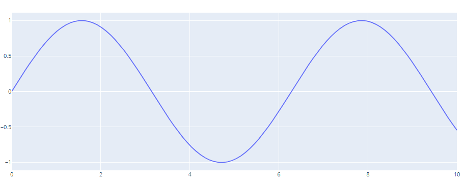
3. グラフ(散布図)を描画する。
「go.Figure()」内の引数の「data」に、グラフの種類(今回は散布図なので「go.Scatter()」とデータの配列を入れて、「fig.show()」でグラフを描画する。「go.Figure(data=[])」でデータを指定する方法のほかに、一度「go.Figure()」を作っておいて、「fig.add_trace()」と書く方法もあります。
import numpy as np
import plotly.graph_objects as go
t = np.linspace(0, 10, 100)
sin = np.sin(t)
fig = go.Figure(data=[go.Scatter(x=t, y=sin)])
fig.show()
【描画されたグラフ】
ここで、「print(fig)」としてみると以下の通り出力されます。
出力結果を見るとどんな引数が必要なのかが分かるので、一度確認するのが良いかと思います。
「data」という引数以外に「layout」という引数があるのも分かりましたね。
詳細は公式ページ「ここ」に載っているのでぜひ参照ください。
print(fig)
>Figure({
    'data': [{'type': 'scatter',
              'x': array([ 0.        ,  0.1010101 ,  0.2020202 ,  0.3030303 ,  0.4040404 ,,,省略]),
              'y': array([ 0.        ,  0.10083842,  0.20064886,  0.2984138 ,  0.39313661,,,省略])}],
    'layout': {'template': '...'}
グラフのカスタマイズ
「go.Figure()」内の引数毎に設定項目と設定方法を説明していきます。
引数「data」で設定できる項目:グラフの種類やプロットの大きさ等のグラフに関すること
引数「layout」で設定できる項目:グラフのレンジ設定やタイトル、凡例などのレイアウトに関すること
グラフの設定について
グラフの種類によって若干設定項目が変わりますが、今回は散布図「go.Scatter」での代表的な設定項目を説明します。
サンプルコードは以下の通りで、「go.Figure()」内の「data」の引数をそれぞれ設定してあげることでグラフの設定ができます。
fig = go.Figure()
fig.add_trace(go.Scatter(x=t, y=sin,
mode='lines+markers',
line=dict(width=2, color='green'),
marker=dict(symbol='circle', size=10, color='blue'),
name="sin",
))
fig.add_trace(go.Scatter(x=t, y=cos,
mode='lines',
line=dict(width=2, color='red'),
name="cos",
))
fig.show()
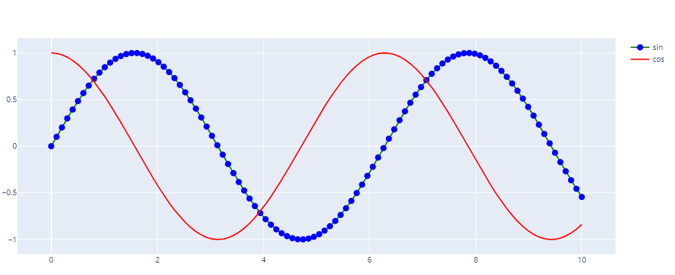
抜粋ですが、簡単な説明は以下の通り
オプション    説明
-mode	    lines+markers: 散布図+折れ線 / lines: 折れ線のみ / markers: 散布図のみ
-line      折れ線の設定 width: ライン幅 / color: ライン色
        (dict形式で渡す or 「line_width=」 のようにアンダースコアを挟んで渡す方法も問題ない)
-marker	    散布図の設定 symbol: プロット形設定 / size: プロットサイズ /color: プロット色
        (dict形式で渡す or 「marker_symbol=」 のようにアンダースコアを挟んで渡す方法も問題ない)
【描画されたグラフ】
また、上記のように設定した後に以下のようにコードを重ねることで、設定の上書きも可能。
「fig.update_traces」の引数に上記と同じ書き方で設定できます。
fig.update_traces(mode='lines+markers', line_color='blue', marker_size=15)
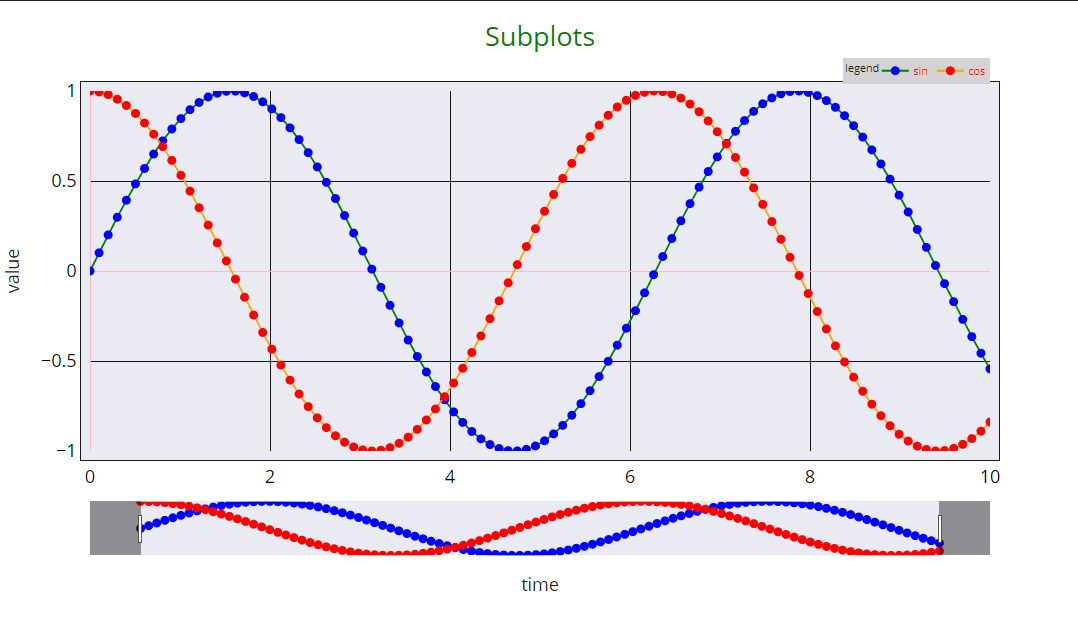
レイアウトの設定について
サンプルコードは以下の通りで、「go.Figure()」内の「layout」の引数をそれぞれ設定してあげることでグラフの設定ができます。コードをコピー/修正いただければ、好きな設定に変更できるのではないでしょうか。
細かい仕様は以下を参照ください。
plotly.com
fig = go.Figure()
fig.add_trace(go.Scatter(x=t, y=sin,
mode='lines+markers',
line=dict(width=2, color='green'),
marker=dict(symbol='circle', size=10, color='blue'),
name='sin'))
fig.add_trace(go.Scatter(x=t, y=cos,
mode='lines+markers',
line=dict(width=2, color='orange'),
marker=dict(symbol='circle', size=10, color='red'),
name='cos'))
fig.update_layout(template='seaborn',
autosize=False, width=1200, height=700,
margin=dict(l=100, r=100, b=200, t=100, pad=10, autoexpand=False),
title=dict(text="Subplots", font_size=30, font_color='green'),
legend=dict(title_text="legend",
orientation="h",yanchor="bottom",y=1.02,xanchor="right",x=1,
bgcolor='lightgrey', font_color='red'),
paper_bgcolor="White",
xaxis=dict(range=[0,10],
rangeslider=dict(autorange=True),
linewidth=1, mirror=True, linecolor='black',
showgrid=True, gridwidth=1, gridcolor='black',
zeroline=True, zerolinewidth=1, zerolinecolor='LightPink',
title=dict(text='time', font_size=20),
tickfont=dict(color='black', size=20)),
yaxis=dict(range=[-1,1],
linewidth=1, mirror=True, linecolor='black',
showgrid=True, gridwidth=1, gridcolor='black',
zeroline=True, zerolinewidth=1, zerolinecolor='LightPink',
title=dict(text='value', font_size=20),
tickfont=dict(color='black', size=20)))
fig.show()
※サンプルコードは、コードがごちゃごちゃするのを避けるため、「fig.update_layout」を使ってレイアウトを調整しています。このオプションも「fig.update_traces」と同じように設定の上書きができるできます。
【描画されたグラフ】
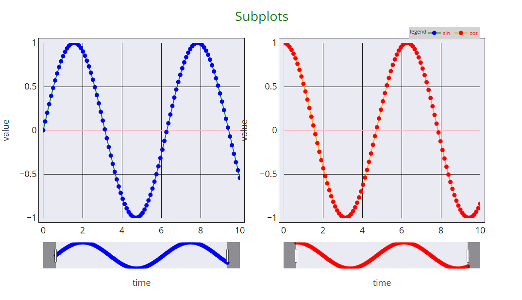
複数グラフの並列描画
Plotlyの「make_subplots」モジュールを使って「fig」を作り、上記と同じように「data」「layout」をグラフごとに設定してあげることで描画することができます。
「data」については、「row」「col」の指定が追加で必要です。
「layout」については、グラフ軸は1グラフ目が「xaxis」「yaxis」、2グラフ目が「xaxis2」「yaxis2」に該当するようです。
from plotly.subplots import make_subplots
fig = make_subplots(rows=1, cols=2)
fig.add_trace(go.Scatter(x=t, y=sin,
mode='lines+markers',
line=dict(width=2, color='green'),
marker=dict(symbol='circle', size=10, color='blue'),
name='sin'), row=1, col=1)
fig.add_trace(go.Scatter(x=t, y=cos,
mode='lines+markers',
line=dict(width=2, color='orange'),
marker=dict(symbol='circle', size=10, color='red'),
name='cos'), row=1, col=2)
fig.update_layout(template='seaborn',
autosize=False, width=1200, height=700,
margin=dict(l=100, r=100, b=200, t=100, pad=10, autoexpand=False),
title=dict(text="Subplots", font_size=30, font_color='green'),
legend=dict(title_text="legend",
orientation="h",yanchor="bottom",y=1.02,xanchor="right",x=1,
bgcolor='lightgrey', font_color='red'),
paper_bgcolor="White",
xaxis=dict(range=[0,10],
rangeslider=dict(autorange=True),
linewidth=1, mirror=True, linecolor='black',
showgrid=True, gridwidth=1, gridcolor='black',
zeroline=True, zerolinewidth=1, zerolinecolor='LightPink',
title=dict(text='time', font_size=20),
tickfont=dict(color='black', size=20)),
yaxis=dict(range=[-1,1],
linewidth=1, mirror=True, linecolor='black',
showgrid=True, gridwidth=1, gridcolor='black',
zeroline=True, zerolinewidth=1, zerolinecolor='LightPink',
title=dict(text='value', font_size=20),
tickfont=dict(color='black', size=20)),
xaxis2=dict(range=[0,10],
rangeslider=dict(autorange=True),
linewidth=1, mirror=True, linecolor='black',
showgrid=True, gridwidth=1, gridcolor='black',
zeroline=True, zerolinewidth=1, zerolinecolor='LightPink',
title=dict(text='time', font_size=20),
tickfont=dict(color='black', size=20)),
yaxis2=dict(range=[-1,1],
linewidth=1, mirror=True, linecolor='black',
showgrid=True, gridwidth=1, gridcolor='black',
zeroline=True, zerolinewidth=1, zerolinecolor='LightPink',
title=dict(text='value', font_size=20),
tickfont=dict(color='black', size=20)))
fig.show()
【描画されたグラフ】